Walgreens Photo Kiosk: Designing Delight Through Scalable Systems
Problem:
The Walgreens Photo Kiosk experience needed a cohesive, emotionally engaging design system to reflect its role in customers’ lives. Without a unified style guide, the interface risked inconsistency, unclear messaging, and disconnection from the core Walgreens brand values of trust, care, and accessibility.
Action:
Created a comprehensive style guide to standardize the Photo Kiosk product’s design language across UI elements, voice, and templates.
Aligned the experience to Walgreens’ brand essence by codifying tone as warm, approachable, and helpful—speaking directly to a female customer navigating a busy life.
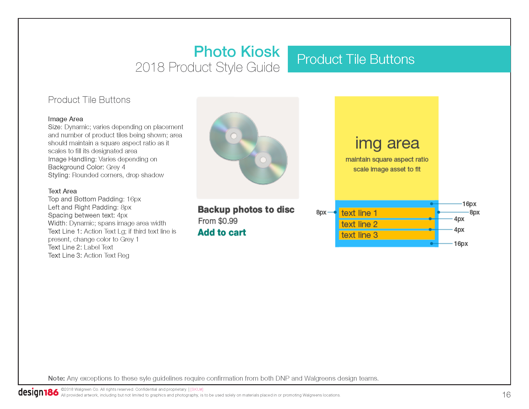
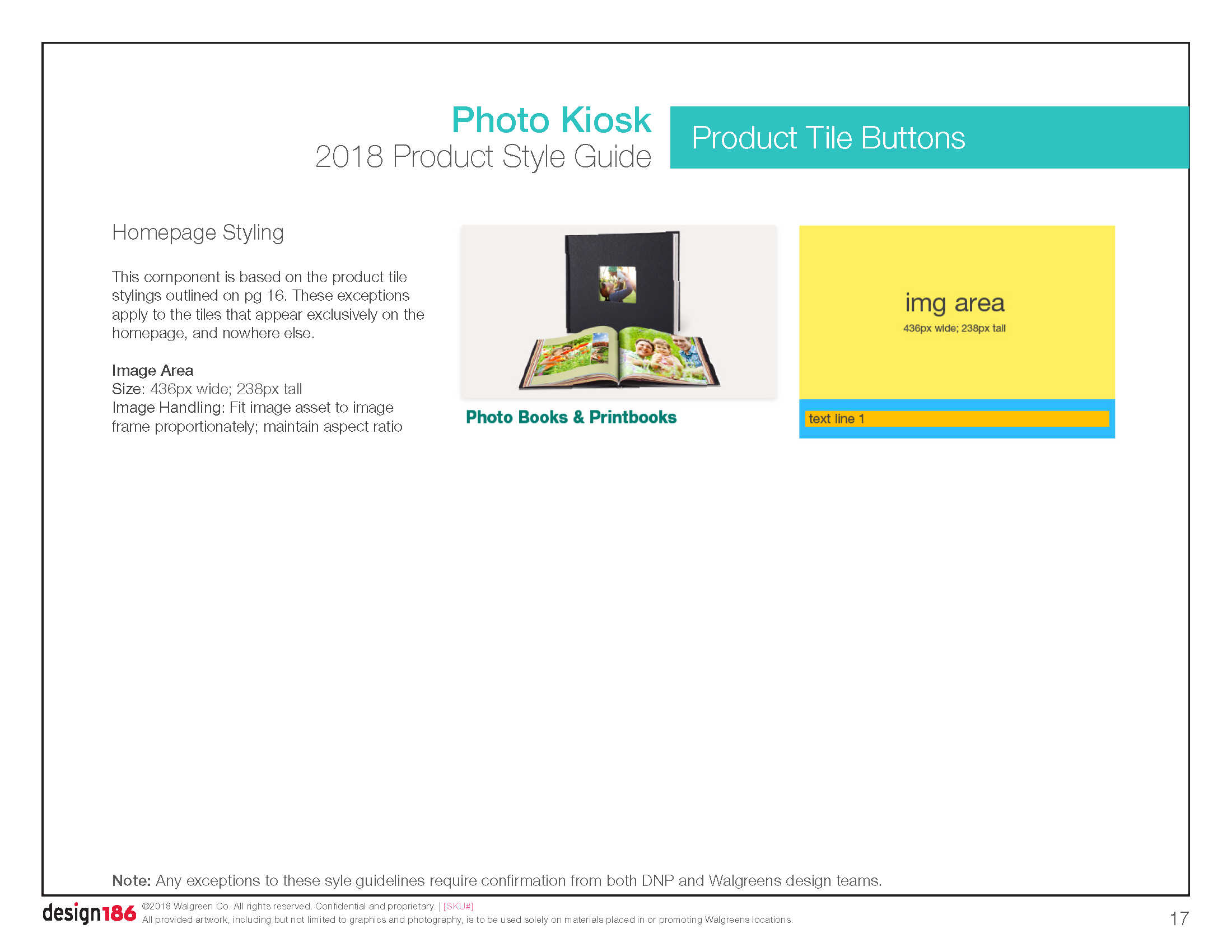
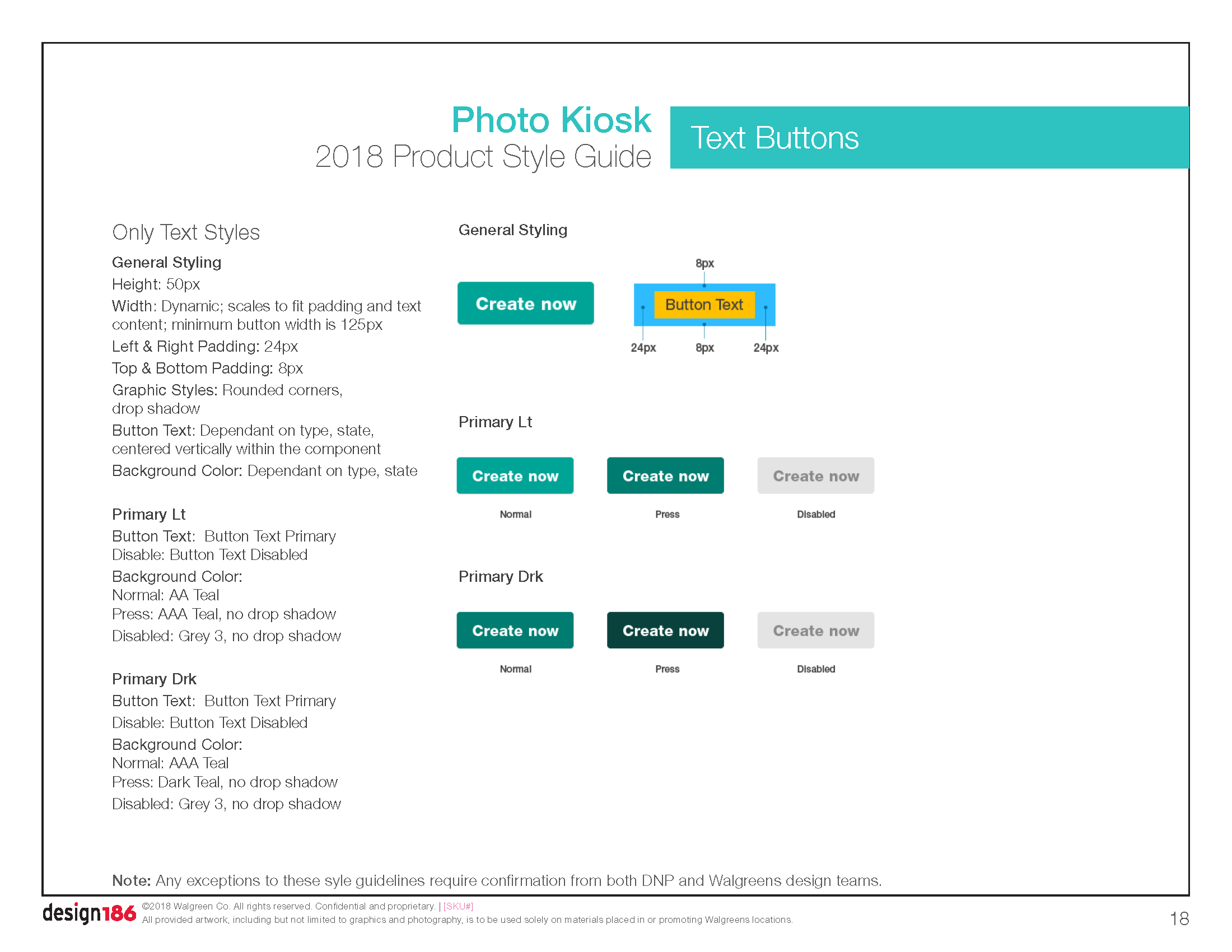
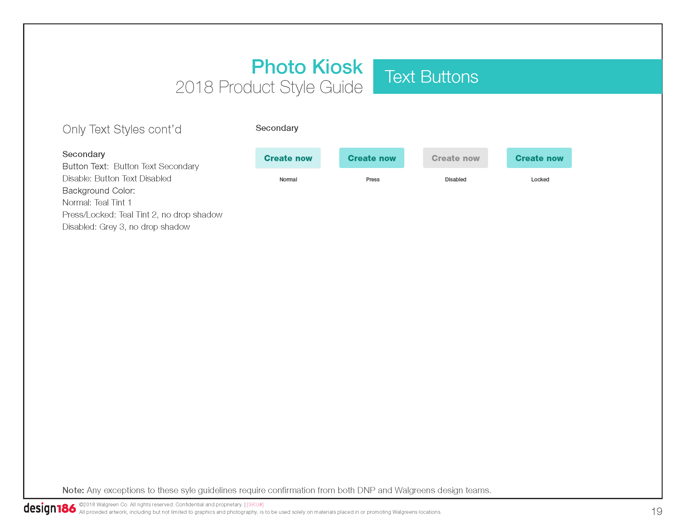
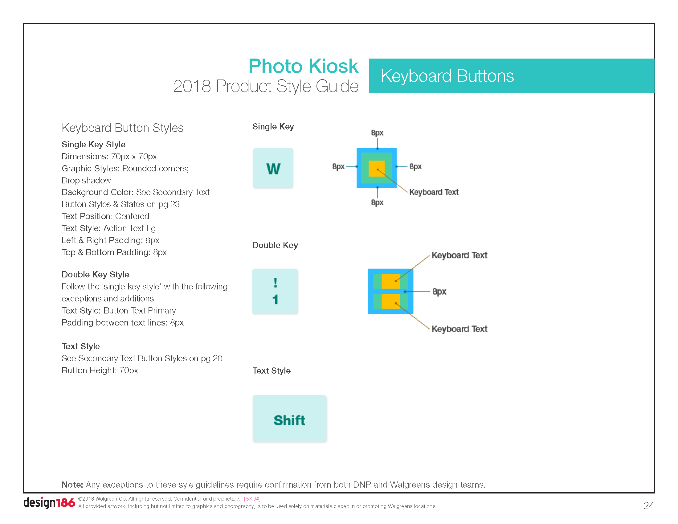
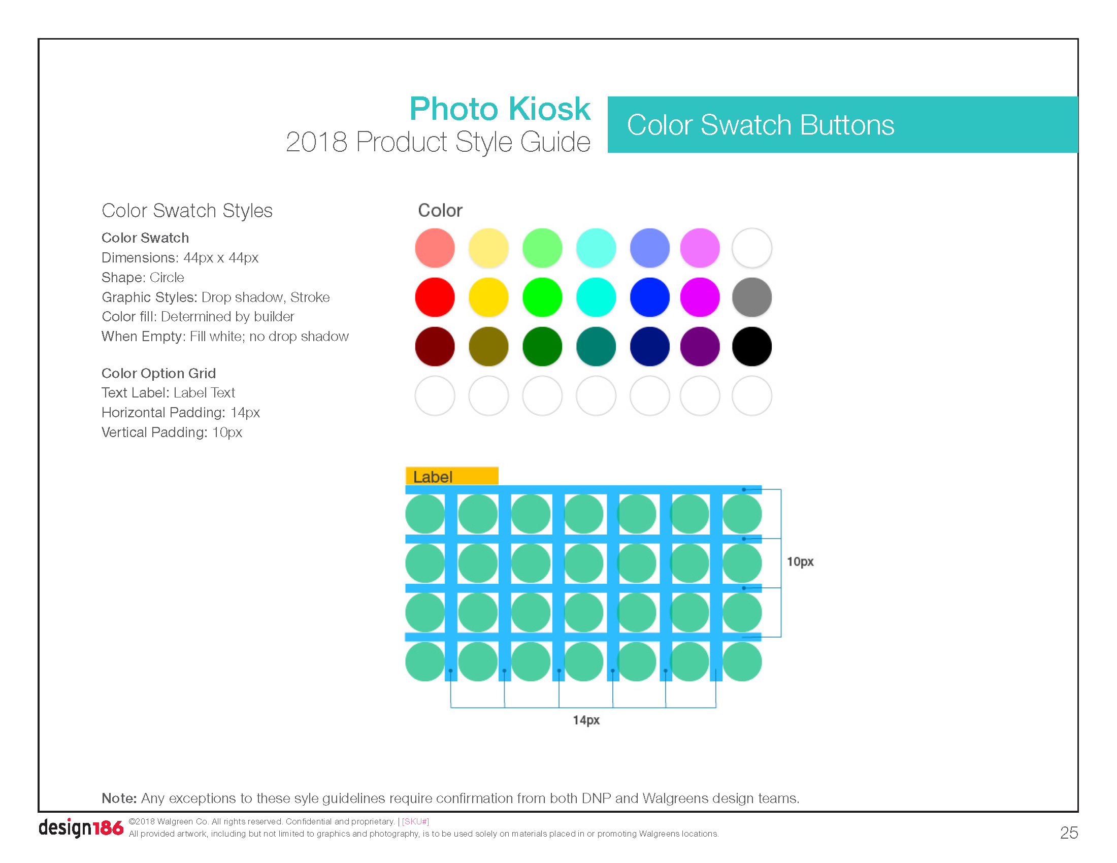
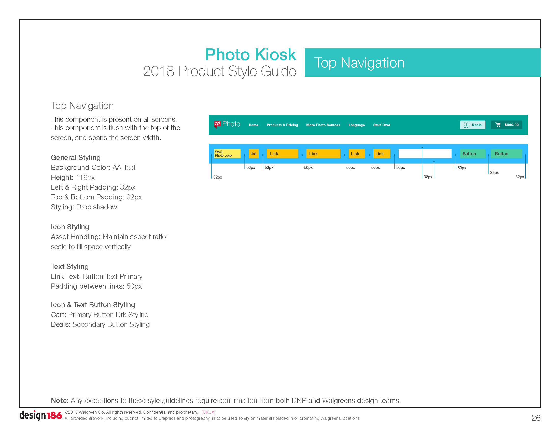
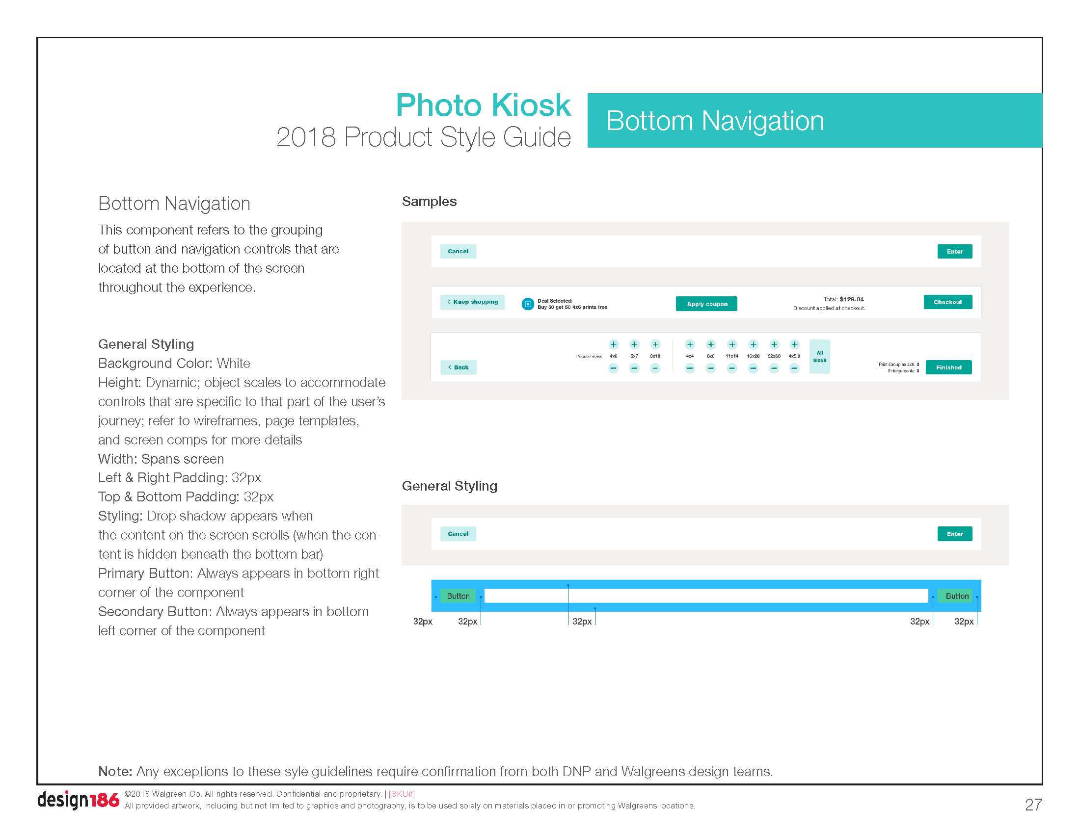
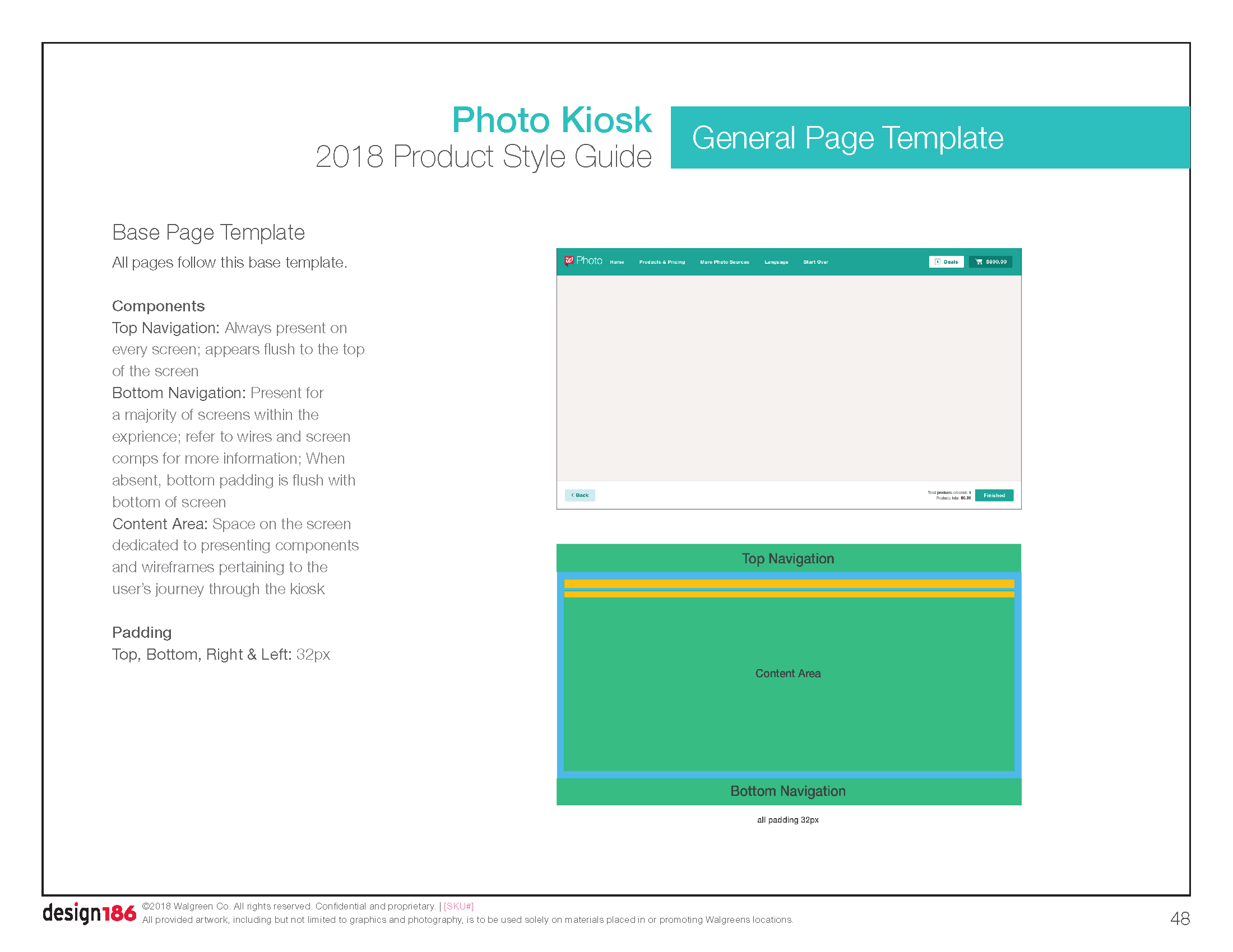
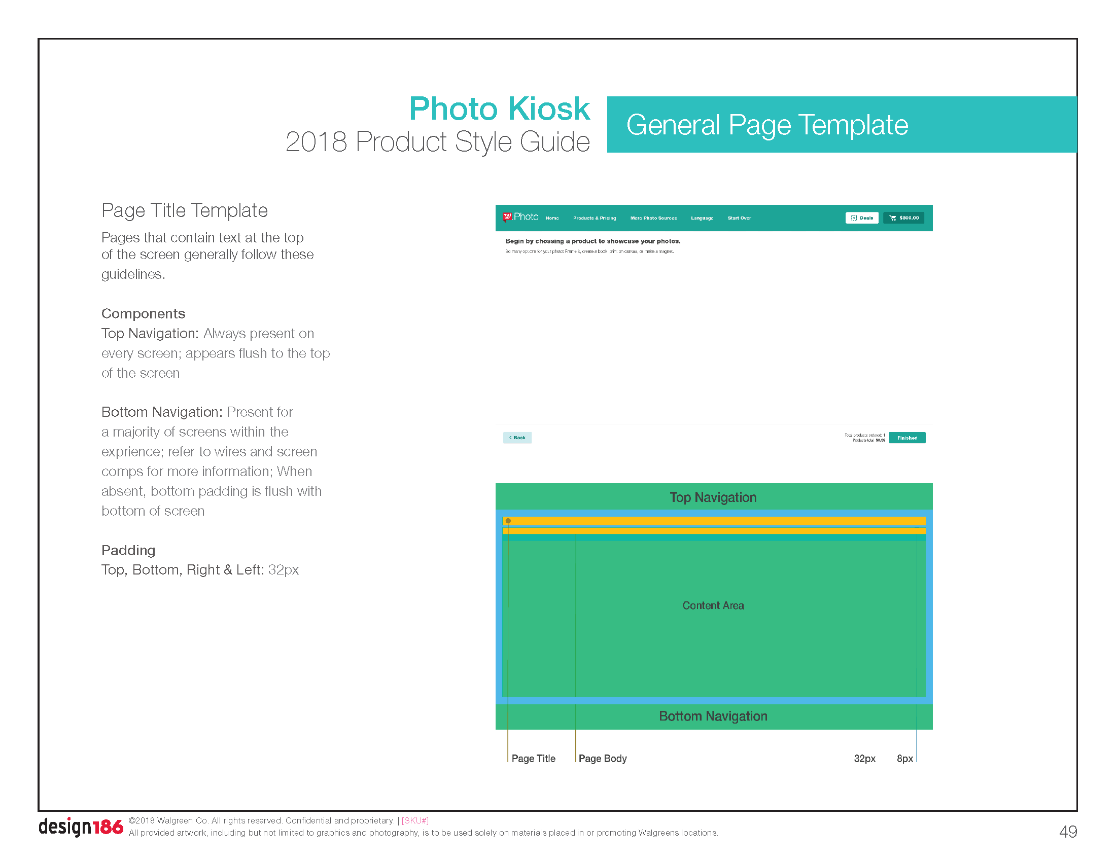
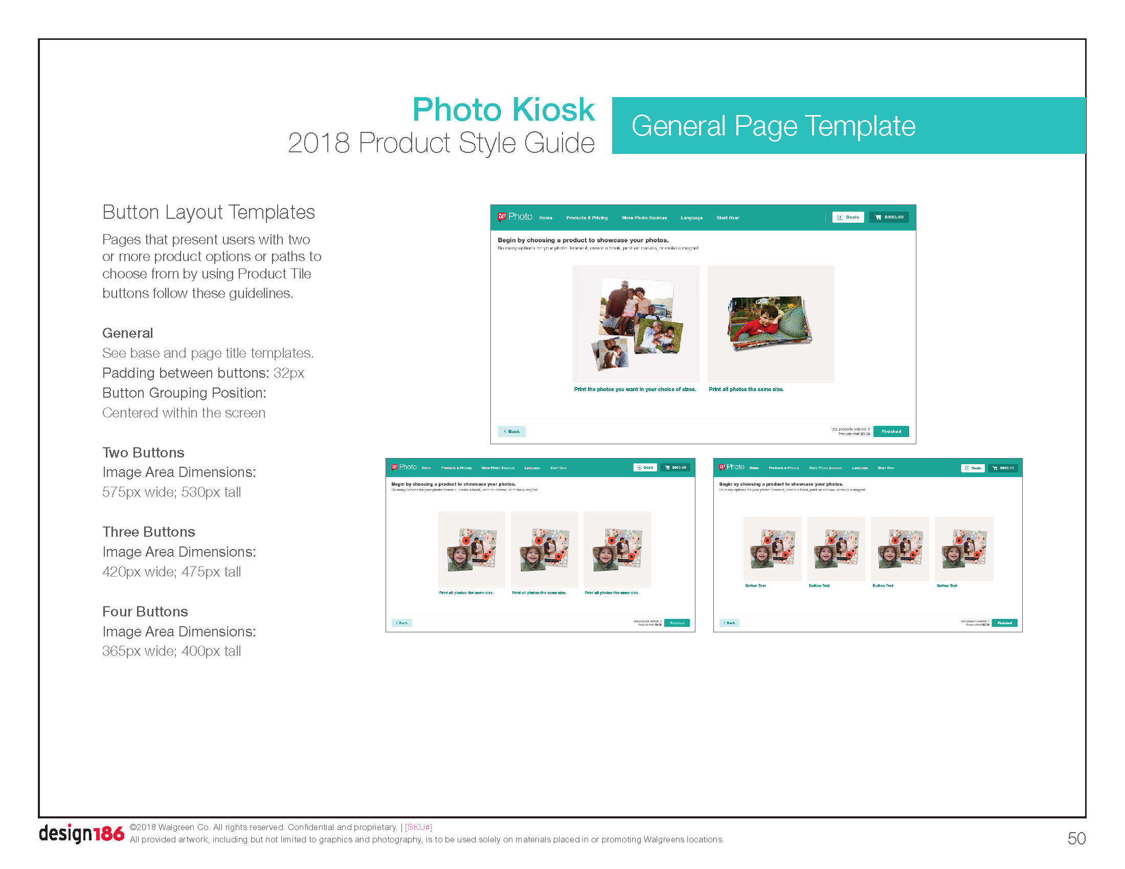
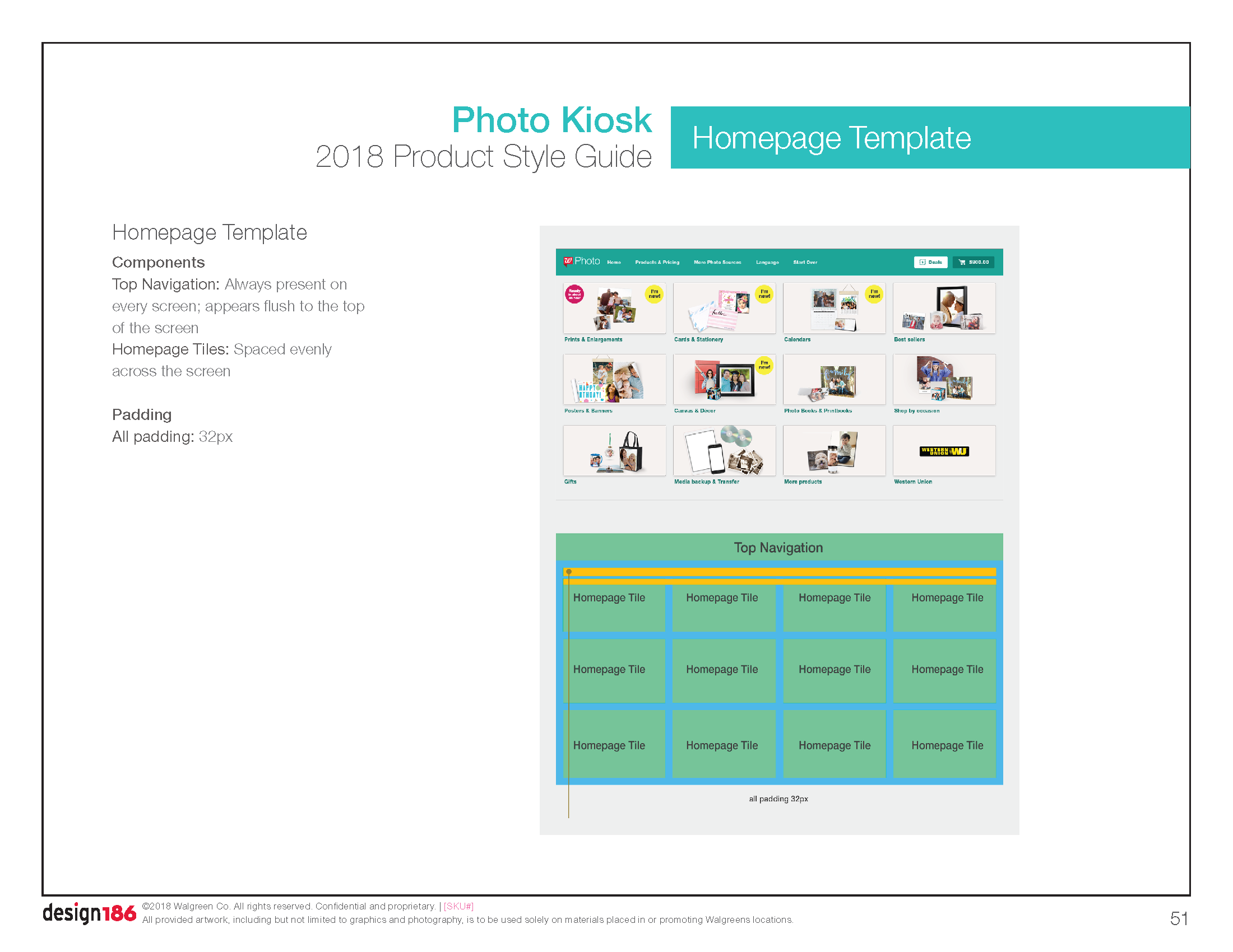
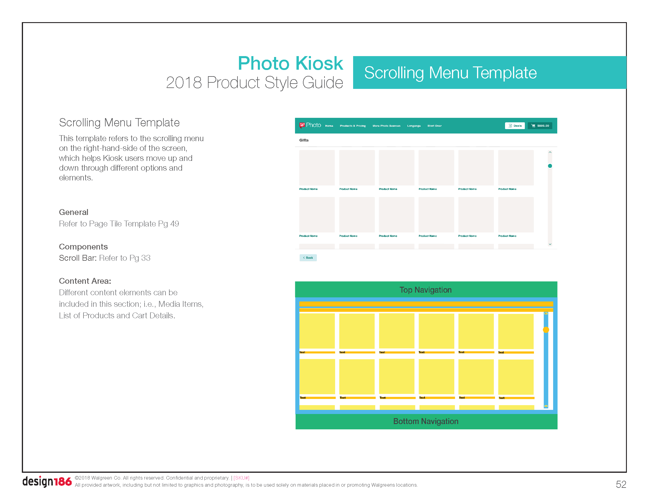
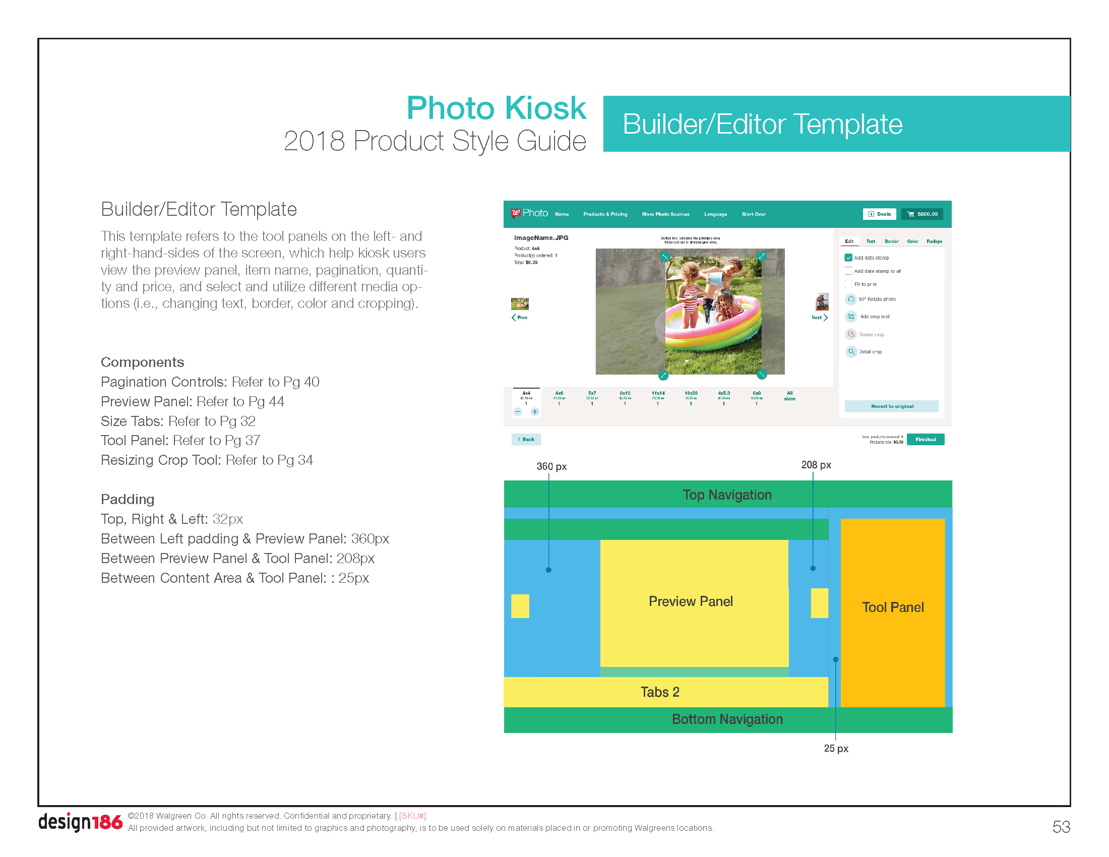
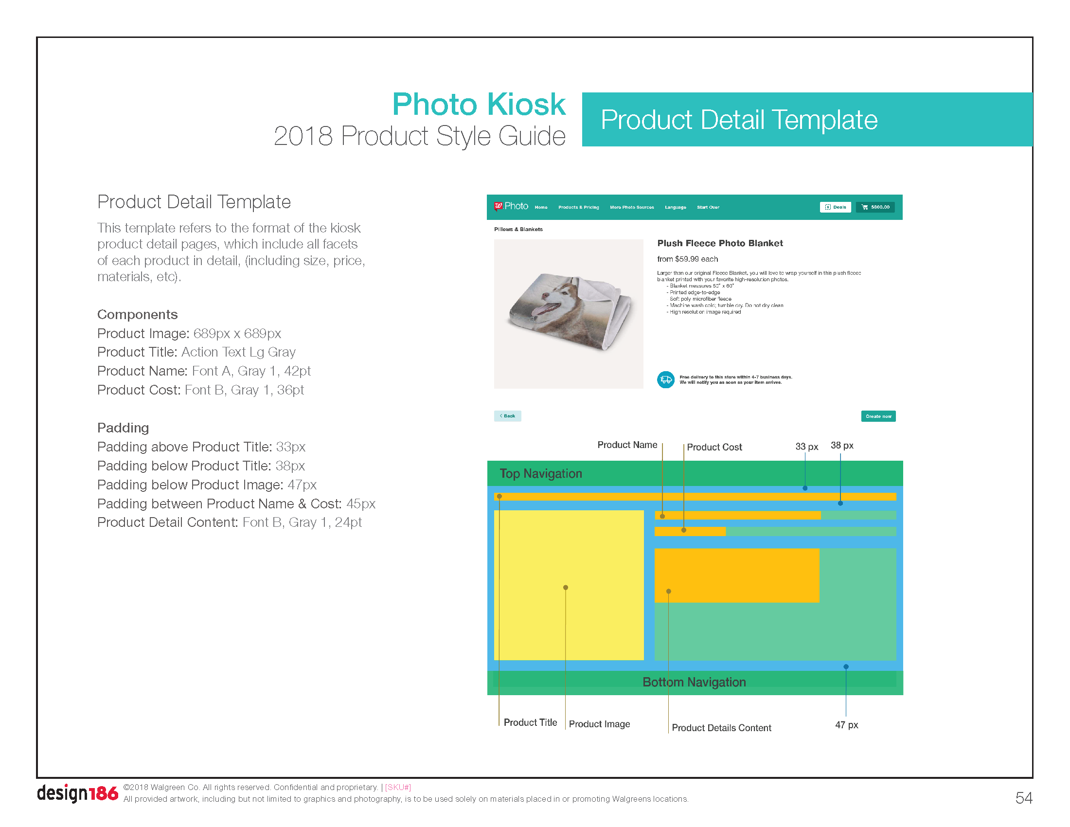
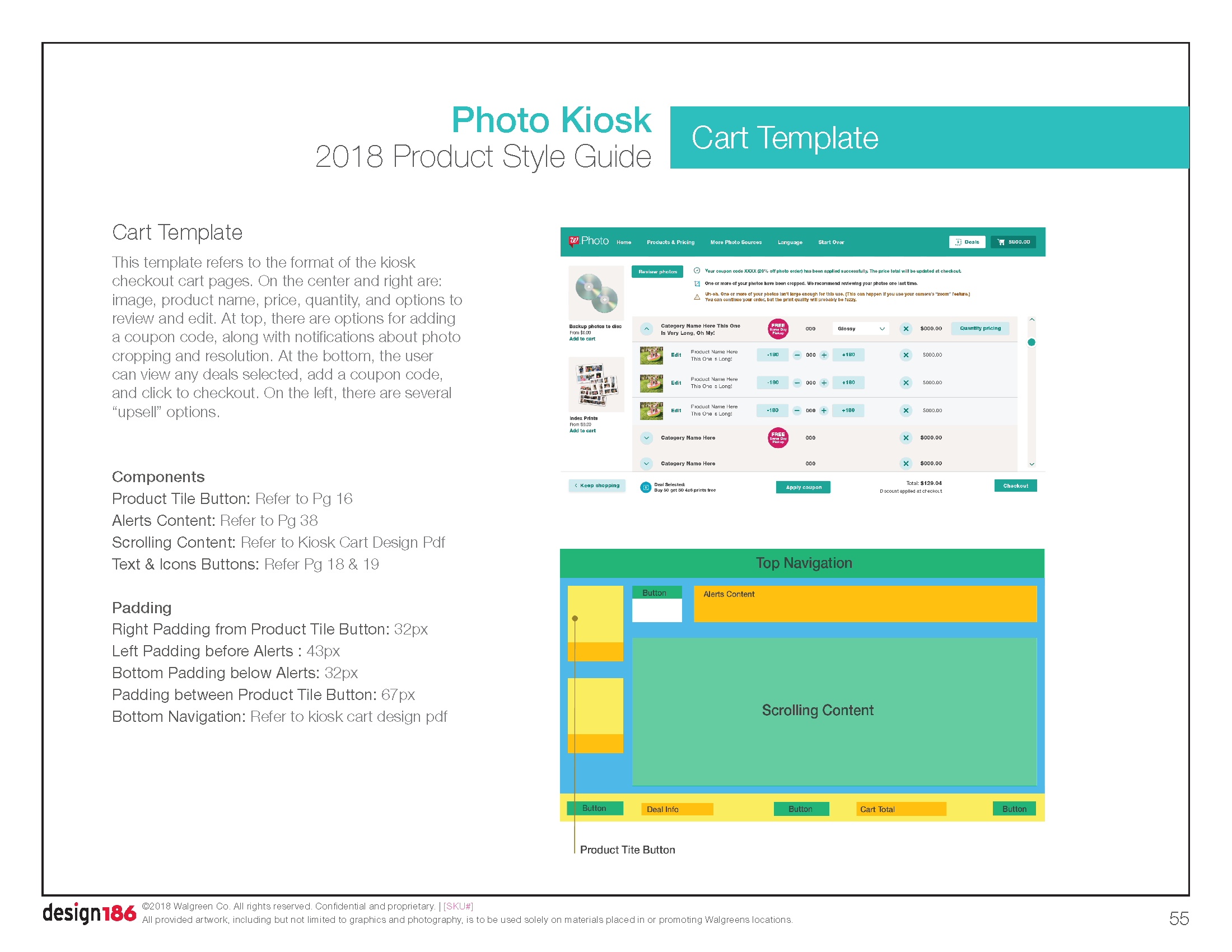
Detailed an extensive design system including:
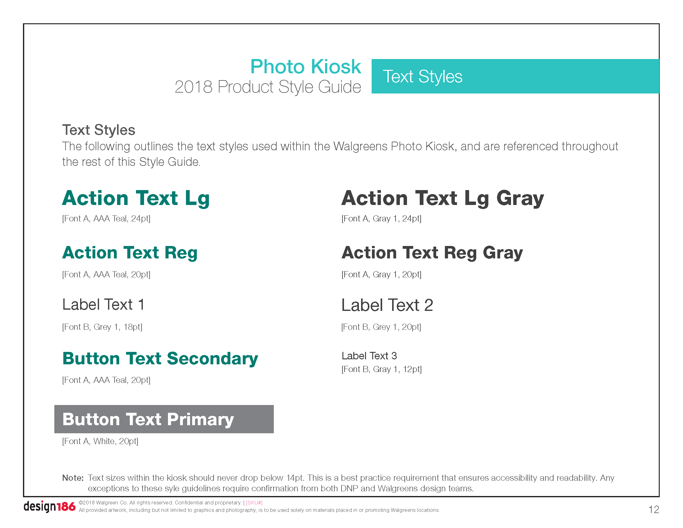
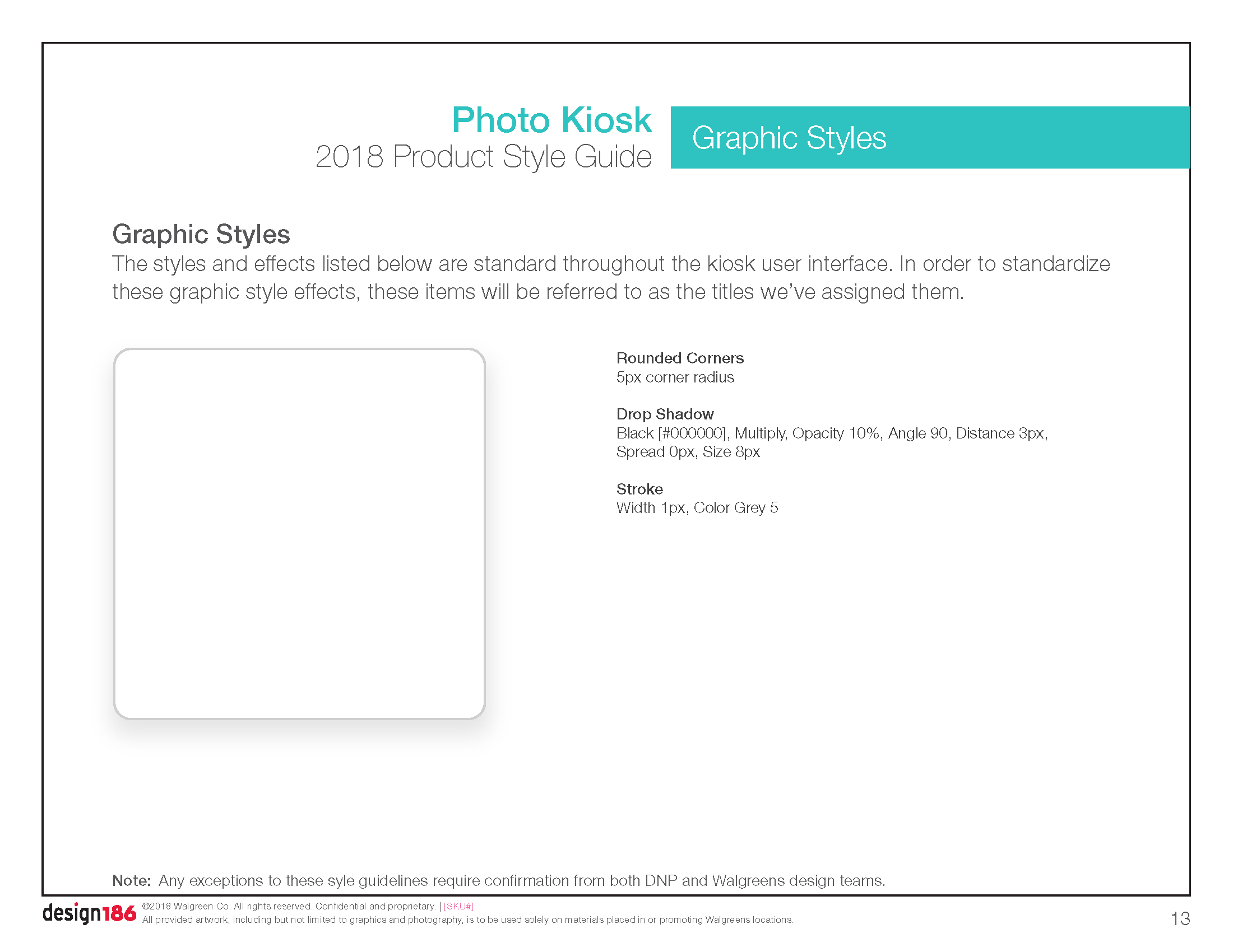
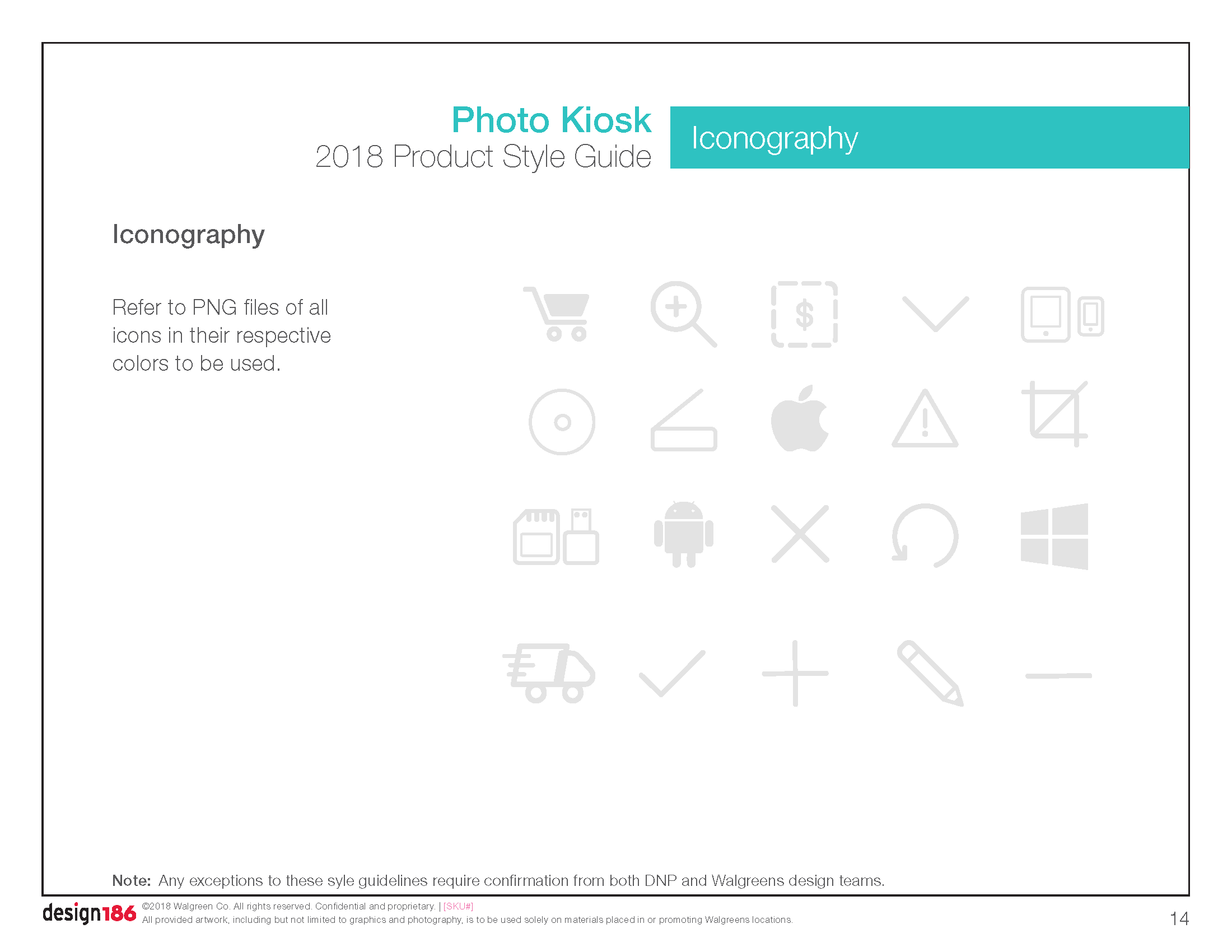
Global patterns like typography, color palettes, and iconography
Component libraries for buttons, navigation, alerts, input fields, and image tools
Templates for homepage, editors, and cart workflows—optimized for intuitive use and consistent design execution
Integrated voice and tone guidelines to ensure conversational, trustworthy copy that enhances user confidence and emotional connection.
Partnered across product, UX, and visual design teams to bring clarity and delight to both internal development and external customer interaction.
Result:
Delivered a scalable toolkit that empowered design and development teams to execute faster with consistent, branded experiences.
Elevated the in-store Photo Kiosk from a transactional interface to a trusted, feel-good extension of the Walgreens brand.
Reinforced Walgreens’ position as a go-to photo service through a friendly, accessible, and inspiring experience—helping customers turn everyday moments into lifelong memories.